# Phase 2: Diverge
The exercises in this phase help us exhaust our imaginations for potential solutions that meet the users' needs.
Before this phase, the team naturally walks around the room reviewing the walls, covered in the critical path and lots of sticky notes.
We start with "pitch practice" again, comparing to the critical path.
We then have each person individually sketch 10+ user flows (opens new window) and user interfaces. We ask people to include the sources where the customer will come from: Twitter? A blog post? AdWords? Automated suggestions? Drip email? Referral from a friend? Push notification?
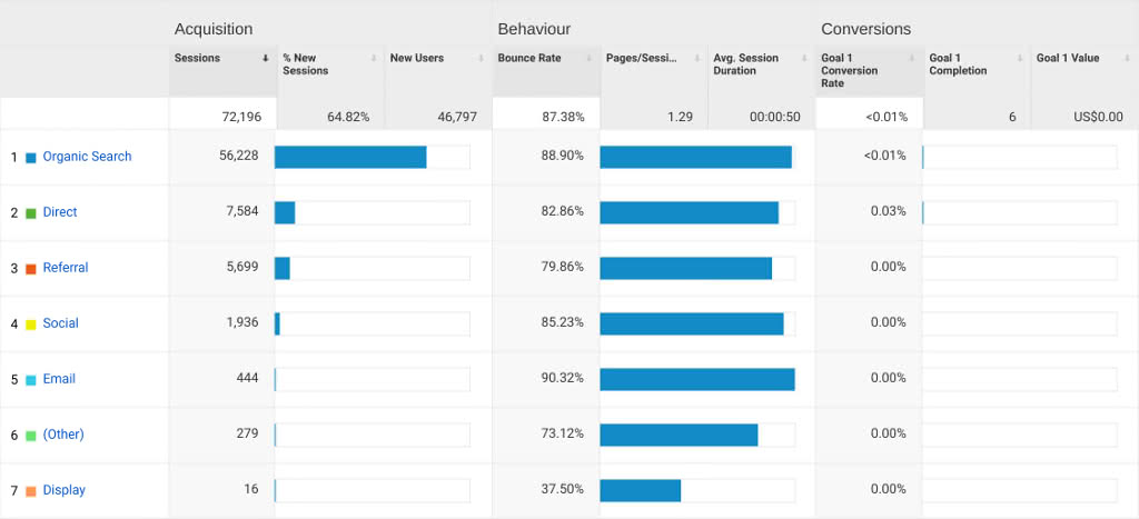
Should the product become realized, these sources should eventually be measured in Google Analytics' "Acquisition Channels" report (opens new window):

We then put those sketches on the wall and begin a silent critique, observing and putting [dot stickers] on different parts of the flows and user interfaces that we like. This helps visually identify the best ideas.
We then do a group critique, three minutes per idea. The group explains their dots. The author can then add any extra commentary. We don't shoot down any ideas or start winnowing. This voting process helps avoid long discussions and design-by-committee.
Lastly, we do a "super vote" with larger, red dot stickers. The CEO or other product owner will place a single "super vote" on what they think is the best idea. This helps us reflect the reality of how their organization makes decisions and affirm their ultimate authority.
Our experience has been that this phase is mentally exhausting. We recommend ending early and sending people home to re-charge their batteries.